SaaS
DSP Mutual Funds
1 week
5 mins
Elevating User Experience in DSP Mutual Funds Mobile App
Introduction:
In today's fast-paced world of finance and investment, simplifying the process of investing in mutual funds while providing educational support is of utmost importance. As a product designer, I undertook the challenge of enhancing the DSP Mutual Funds mobile app. This blog aims to provide a comprehensive overview of my research-driven design process, highlighting how I reimagined the user experience by incorporating key design principles and methodologies.
Research Phase:
To truly understand the user's perspective and to address their needs and concerns, the research phase was crucial.
1. User Interviews and Surveys:
To obtain insights into user preferences, pain points, and expectations, I conducted in-depth user interviews and surveys. These conversations helped in uncovering the primary areas that needed attention within the app.
2. Heuristic Evaluation:
Applying Jakob Nielsen's ten usability heuristics as a benchmark, I conducted a heuristic evaluation of the existing app. This assessment highlighted the primary usability issues, with a notable focus on the complex and time-consuming nature of the investment process.
Design Phase:
Informed by the insights from the research phase, the design phase aimed to revamp the user experience.
1. Information Architecture:
I started by revisiting the app's information architecture, making sure that content was organized intuitively. This ensured that users could easily access the relevant information necessary to educate themselves about mutual fund investments.
2. Streamlined User Flow:
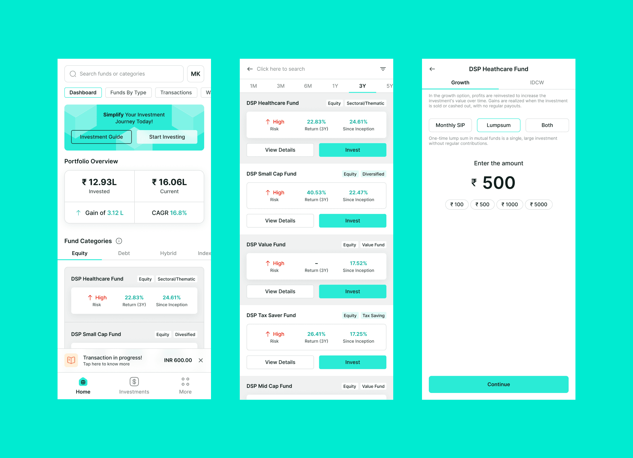
The existing investment process was intricate and time-consuming. To address this, I reduced the number of steps required for investing a lump sum amount. Additionally, a progress tracker was introduced to help users understand where they were in the process.
3. Educational Resources:
Recognizing that learning is a fundamental aspect of investing, I integrated educational resources within the app. These resources included articles, videos, and interactive tutorials. Users could access this material to gain valuable knowledge before making investment decisions.
4. User-Friendly Language:
Effective communication is essential when educating users about financial matters. Therefore, I revamped the app's content to ensure that it was user-friendly and easily comprehensible for individuals with varying levels of financial knowledge.
Conclusion:
The redesigned DSP Mutual Funds mobile app underwent a transformation aimed at enhancing the user experience. By incorporating user-centered research, streamlining user flows, integrating educational resources, and refining the language used, the app now strikes the perfect balance between user-friendliness and financial education.
This redesign makes mutual fund investments more accessible and efficient, but most importantly, it prioritizes education. It underscores the importance of making financial information and investment processes comprehensible to the everyday user, regardless of their level of financial literacy.
By following established design principles and methodologies, the DSP Mutual Funds mobile app now serves as a prime example of how a user-centered design approach can elevate a product. It benefits not only the end users but also the business that provides the service, ultimately enhancing the mutual fund investment experience for all.
I've curated a collection of Figma links for user flows, wireframes, website design, marketing campaigns, and branding assets. Please find the links below:
Flow:
https://bit.ly/3S94plU
Manav Kumbhare • August 8, 2023
